Paint the Pavement
Fall 2016 - Project focused on information and "call to action" communication. Materials created using Adobe Creative Suite, ink/painted imagery, printed booklet (hand-bound) and poster.

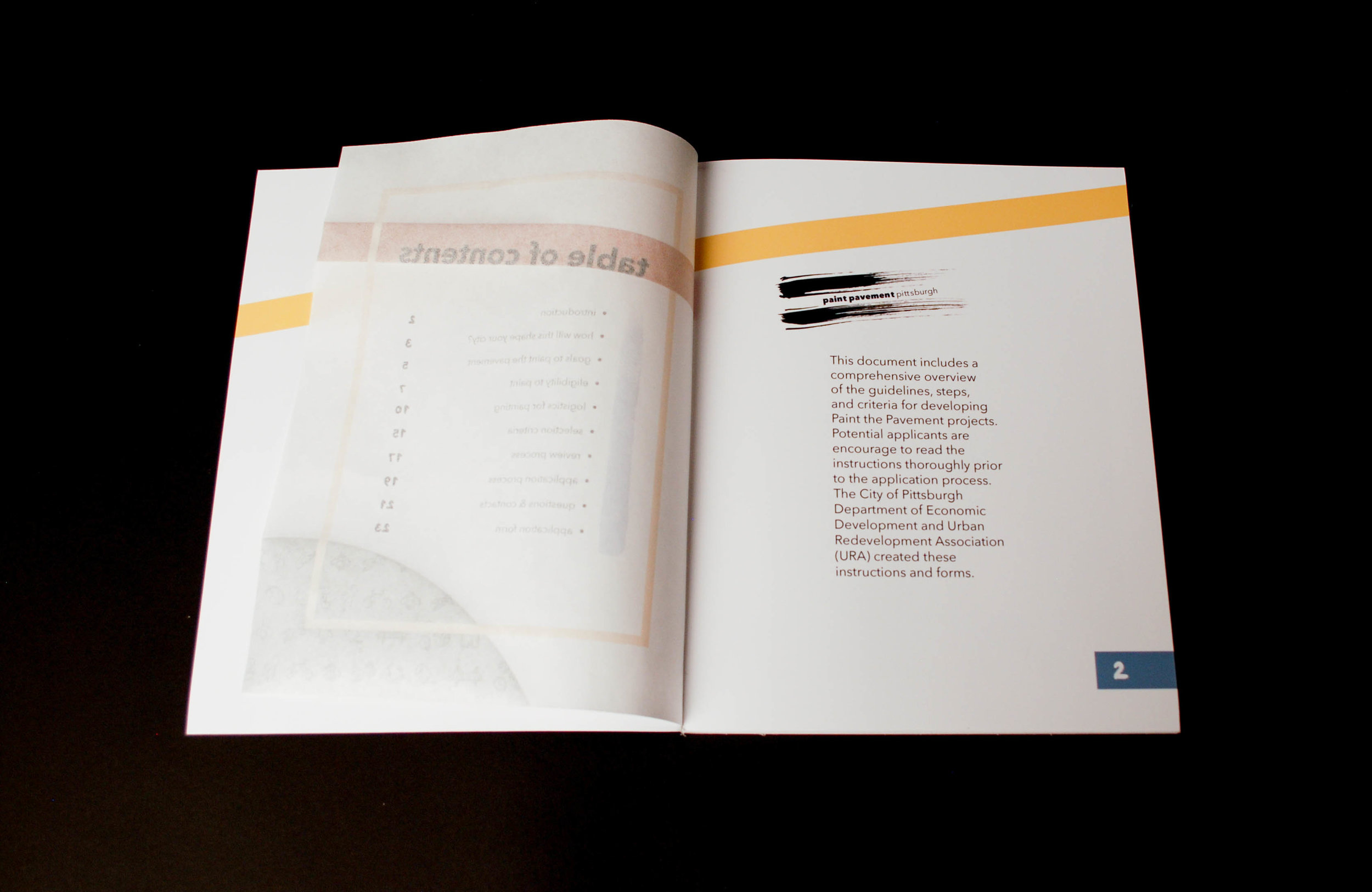
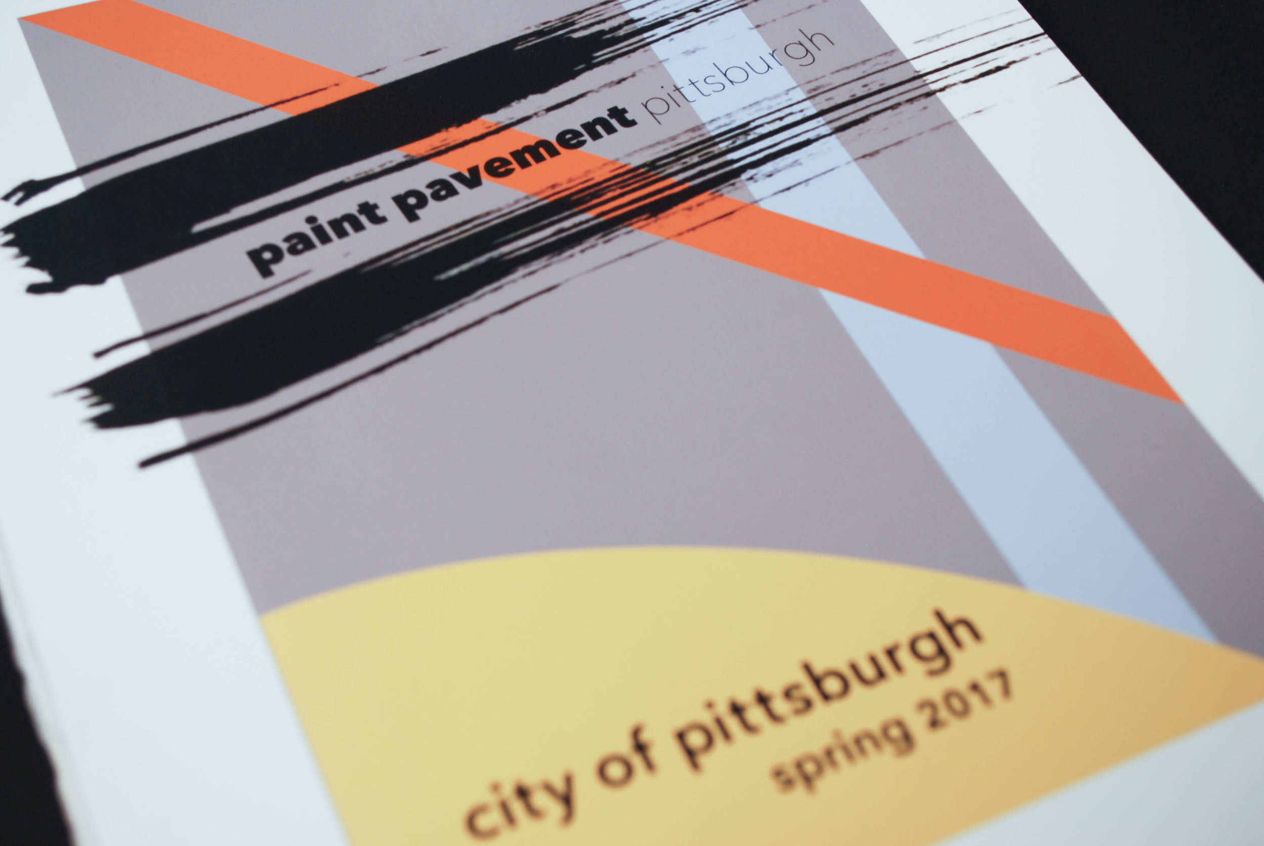
Paint the Pavement Pittsburgh: Booklet
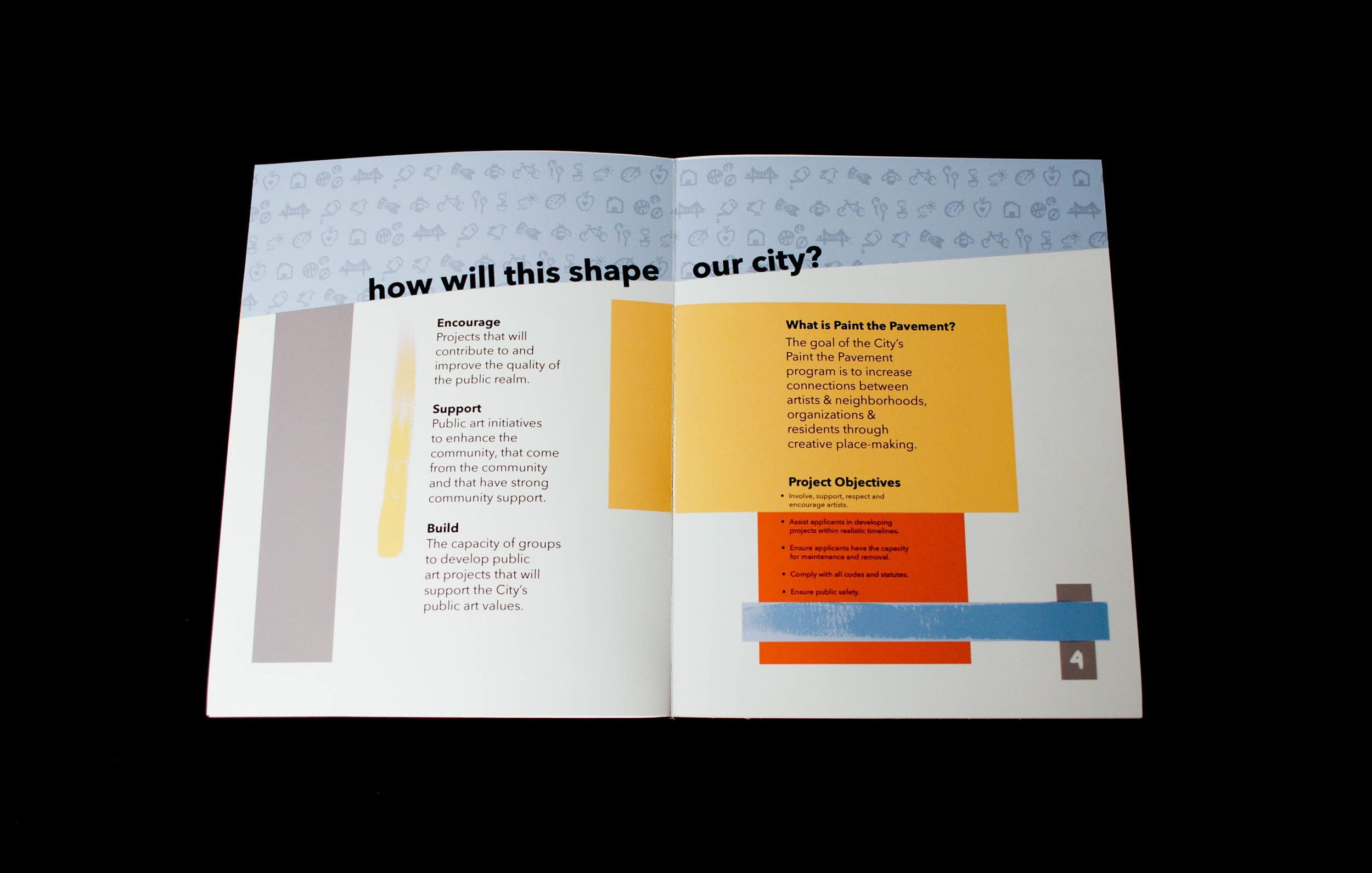
Paint the Pavement is a call to action to engage the community and bring awareness about street safety within cities. My response and presentation of this information is meant to inspire the neighborhoods to take care of their city. Pittsburgh is made up of rich culture, life and passion. Each part of the city holds a sense of pride around their background and history.
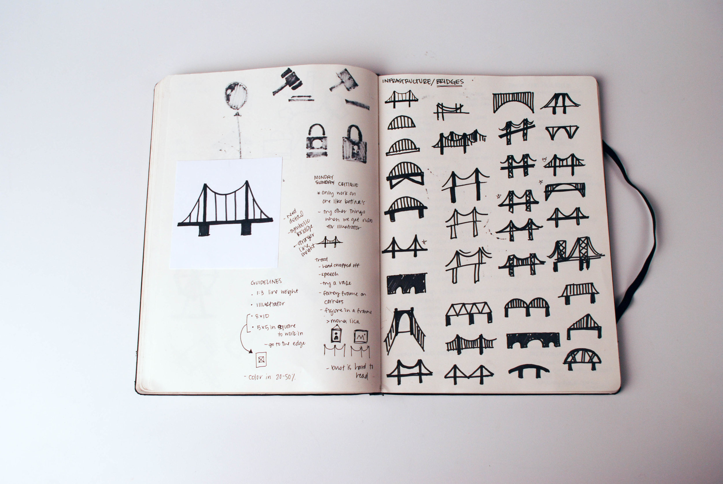
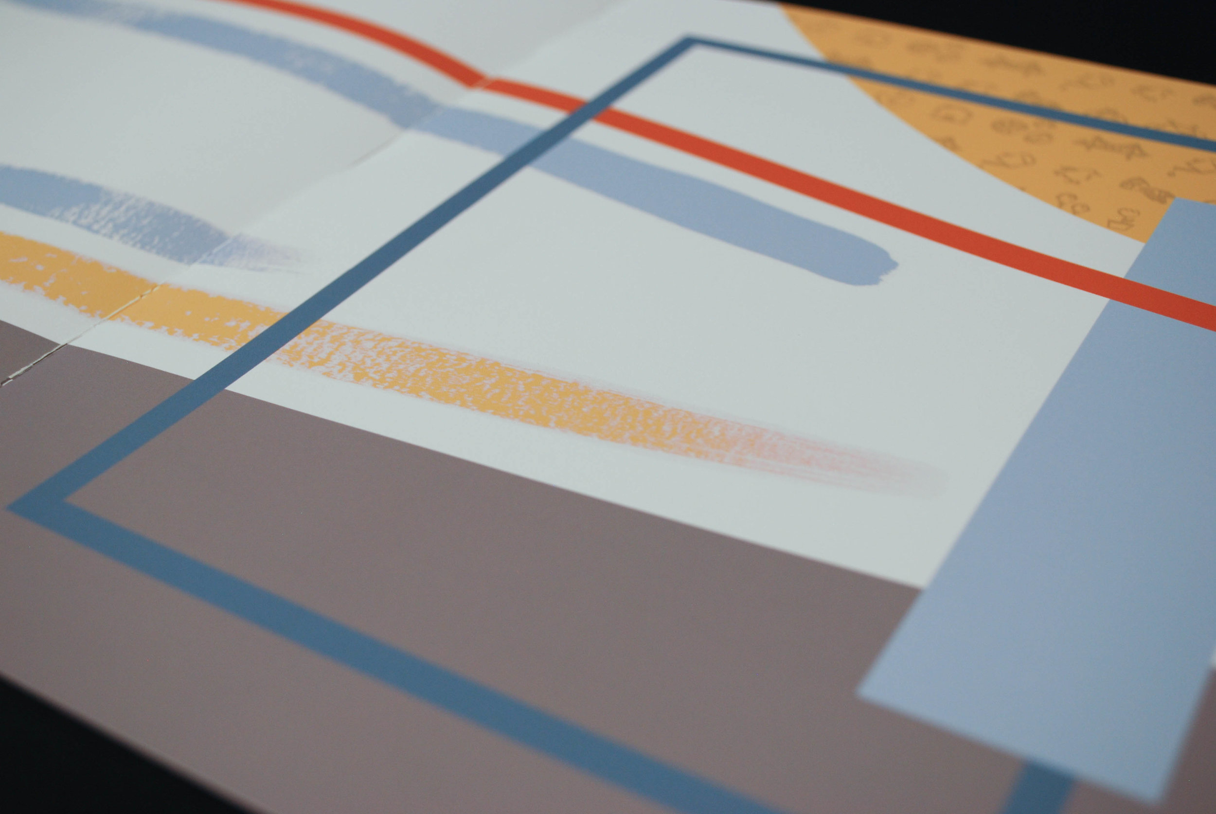
I was inspired by the city, its landscape and the passion of the people. Pittsburgh holds a special sense of pride for its bridges, colors and structure. As a result of all of these ideas, I created my color system and grid based on images I had taken of the city and played around with them to establish a cohesive blend of color and ensure that the colors worked well together.
For this booklet, I focused on pushing myself through practice and rigor. I created many iterations and I am proud of how this turned out in the end. I spent time looking for visual tension and establishing creative word play. I used my own imagery and honed in on the intent and clarity of my systems. I aimed for integrity and hoped it would inspire people to paint the pavement in Pittsburgh.


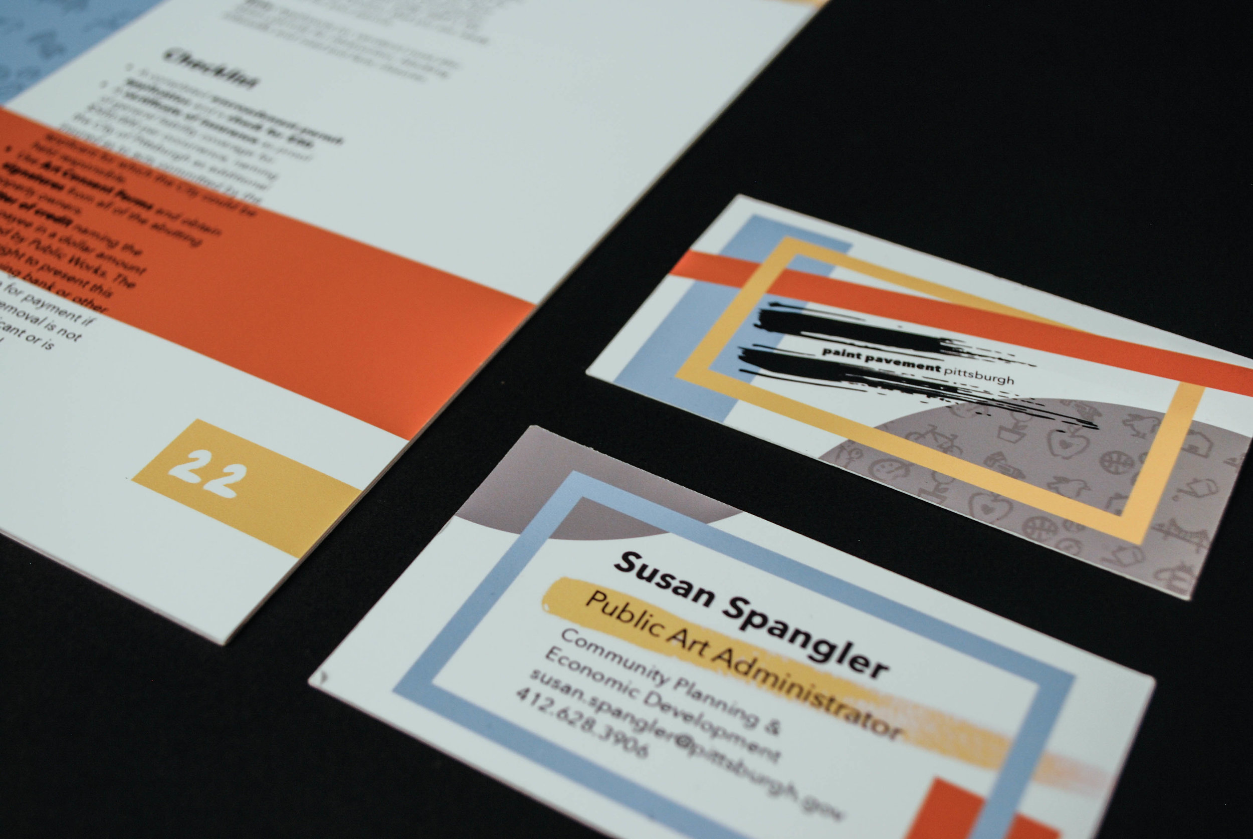
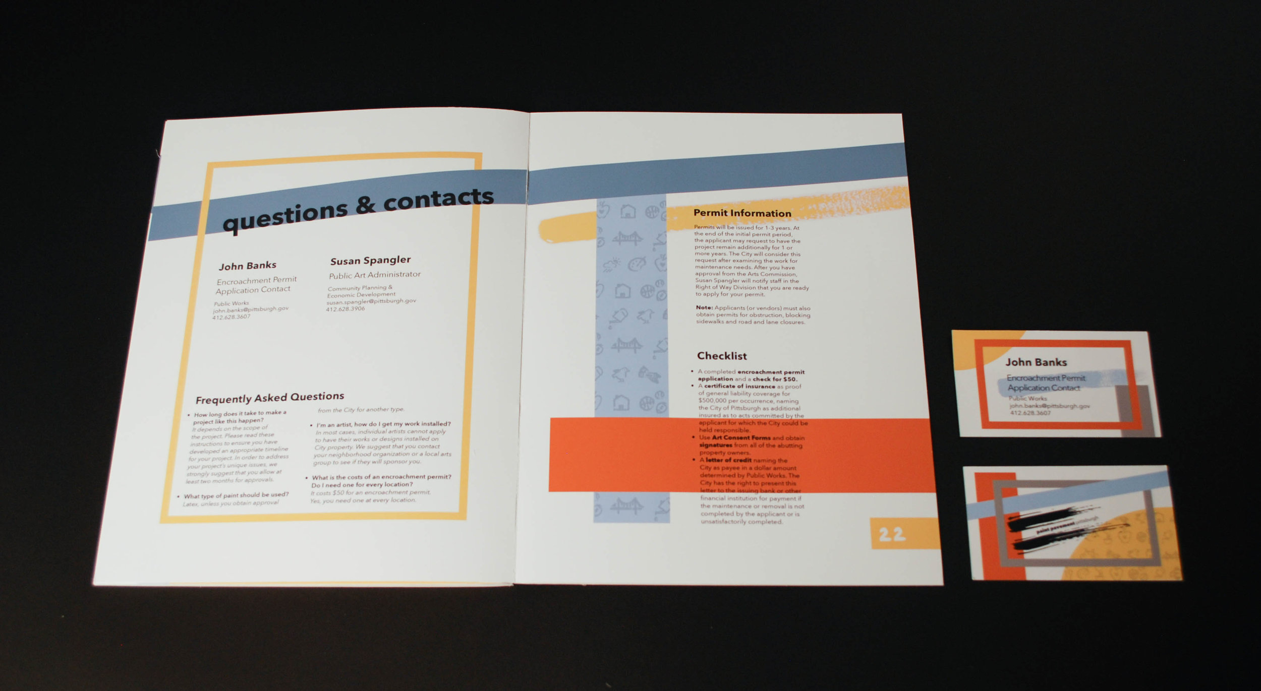
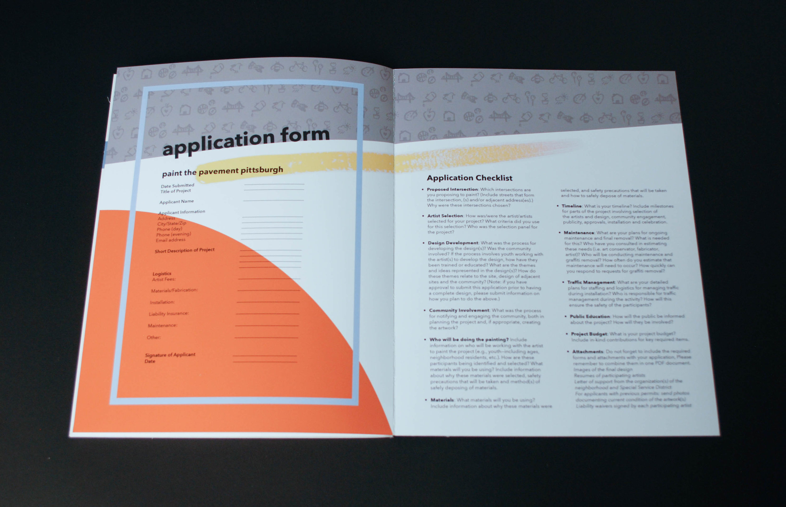
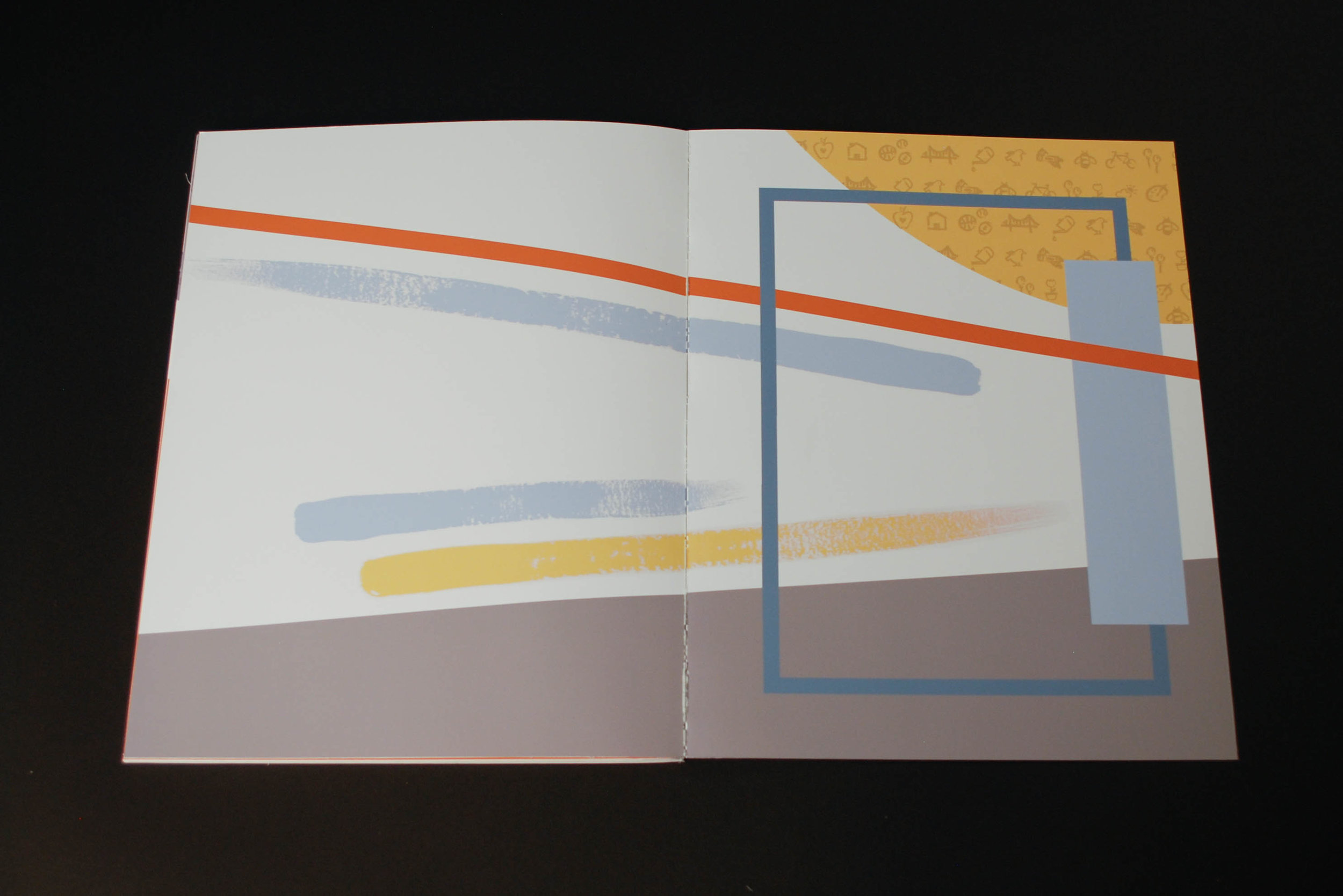
Featured Elements
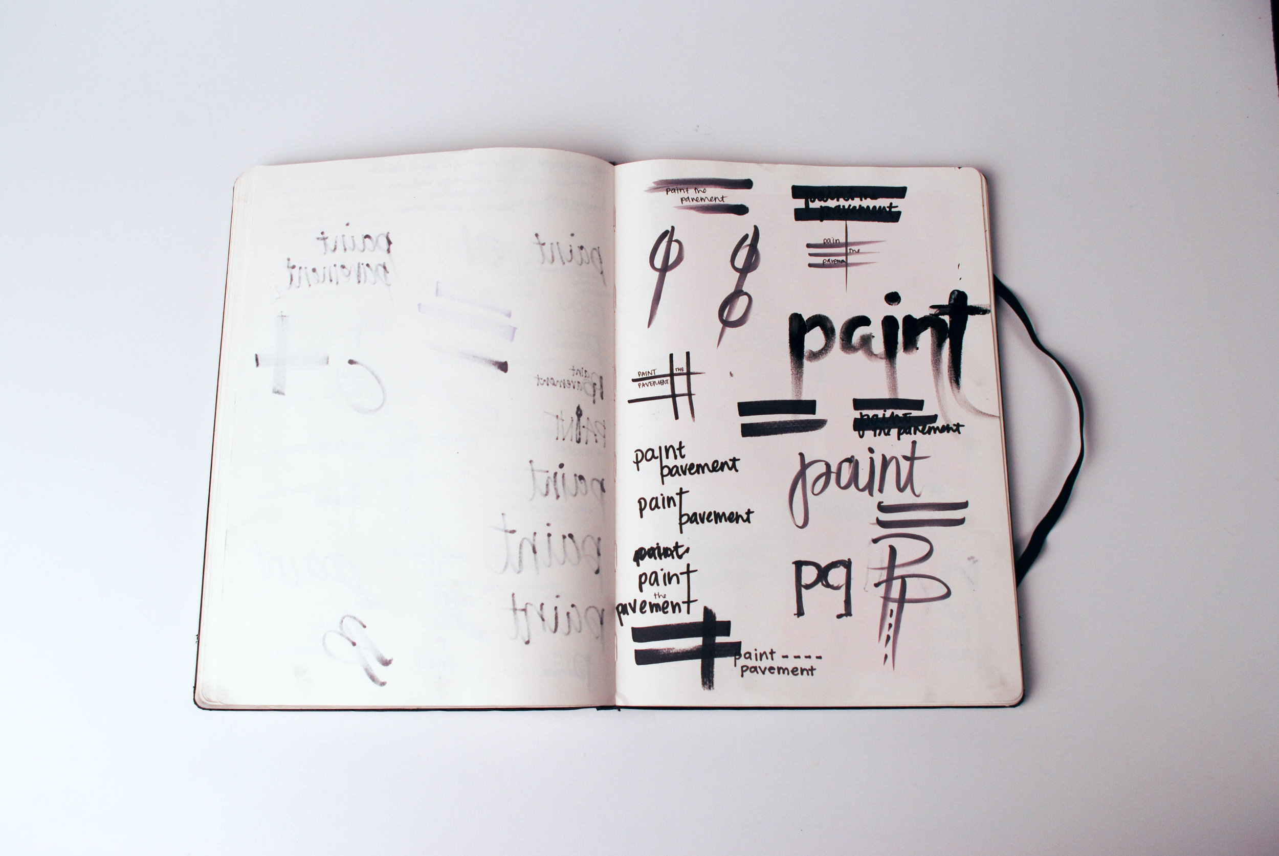
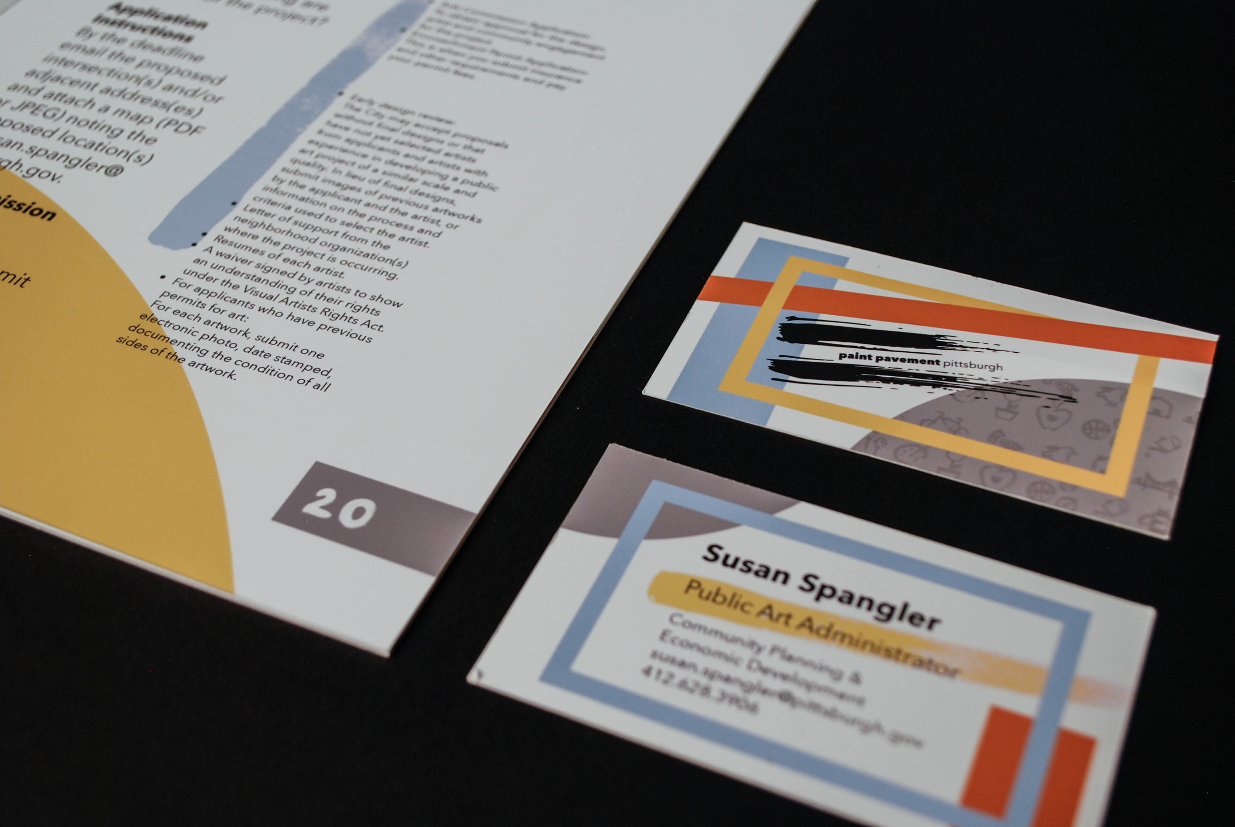
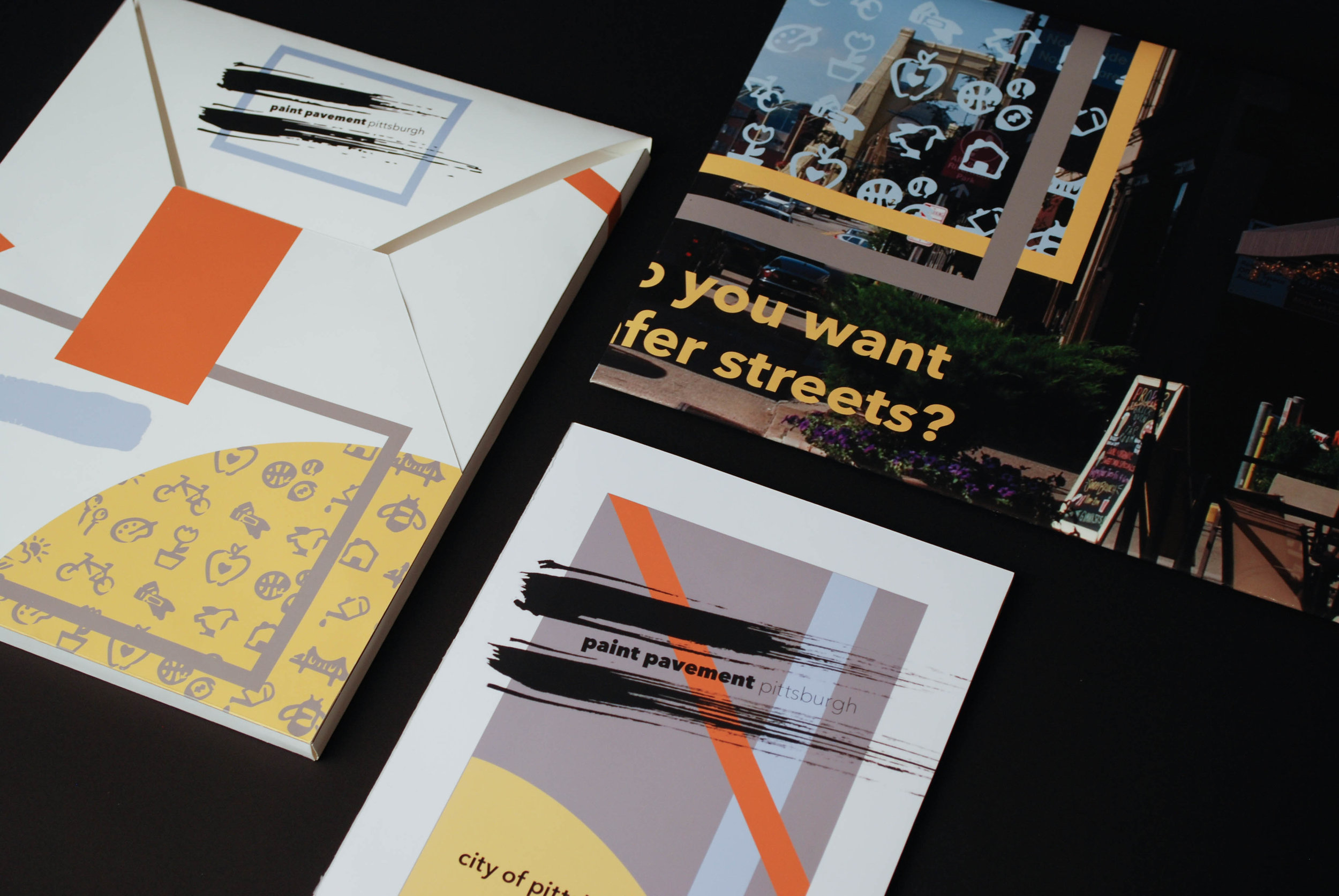
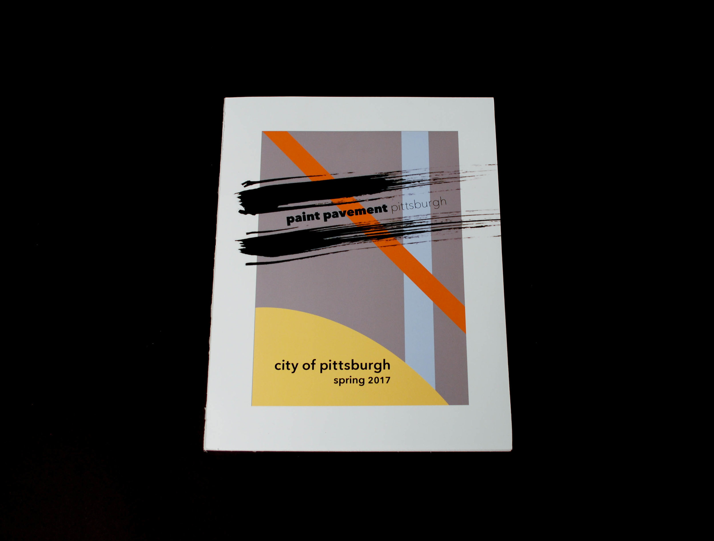
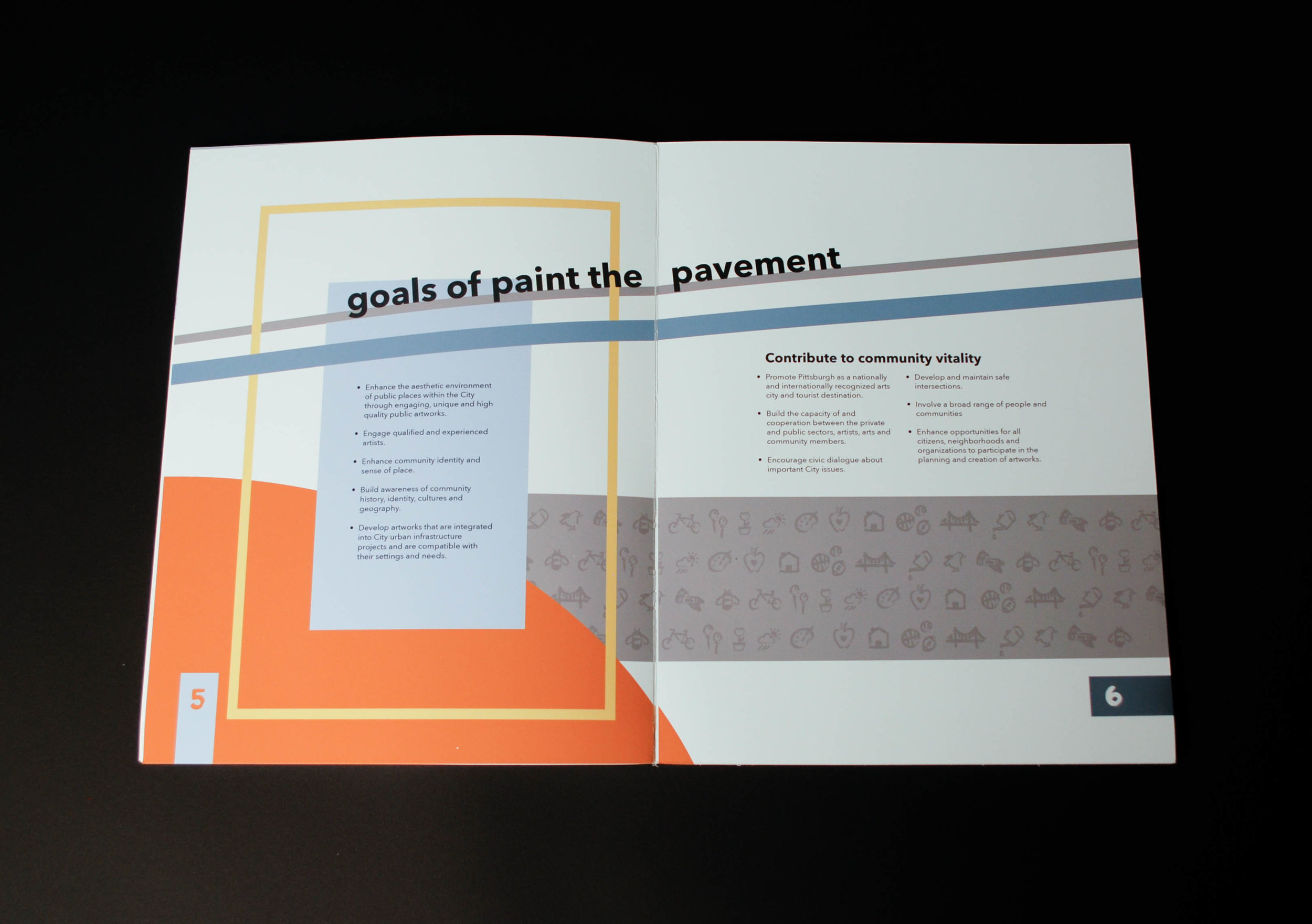
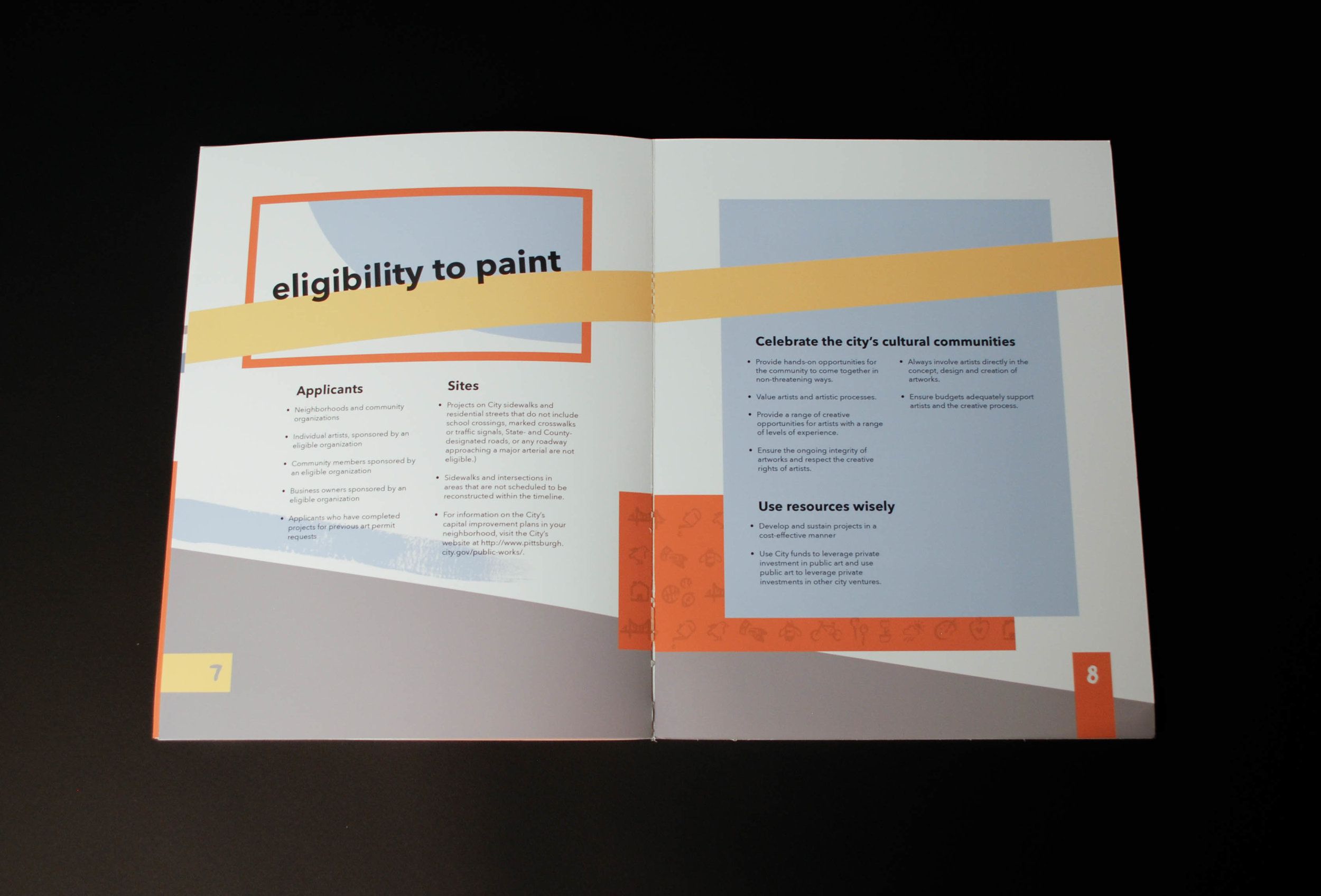
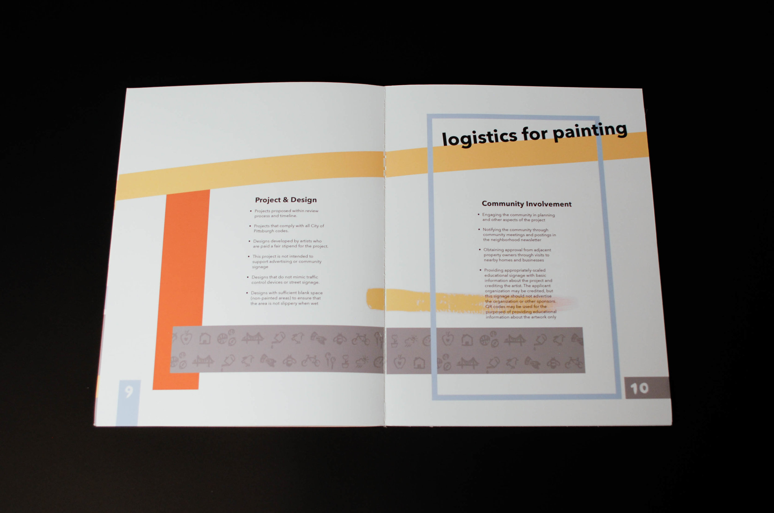
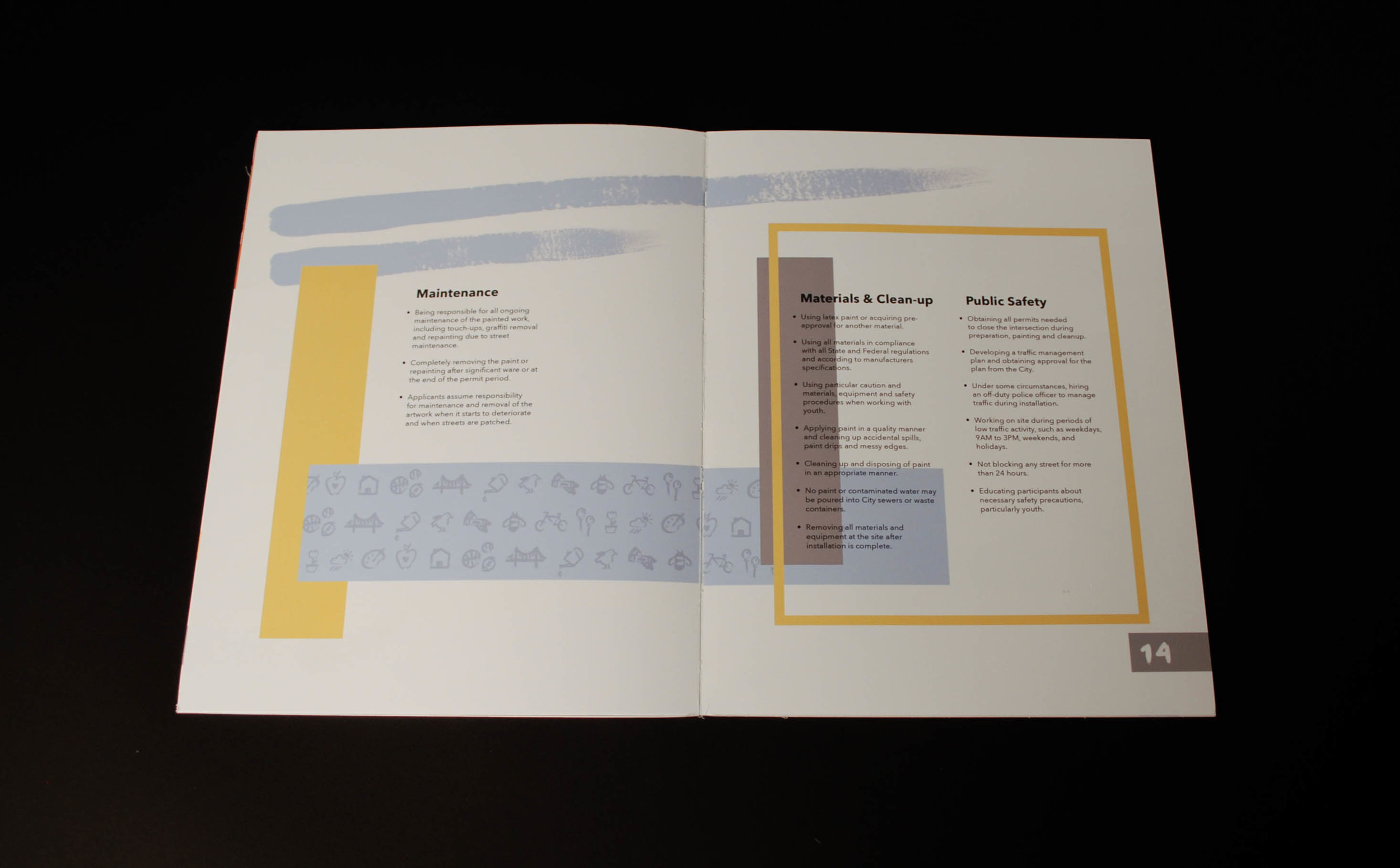
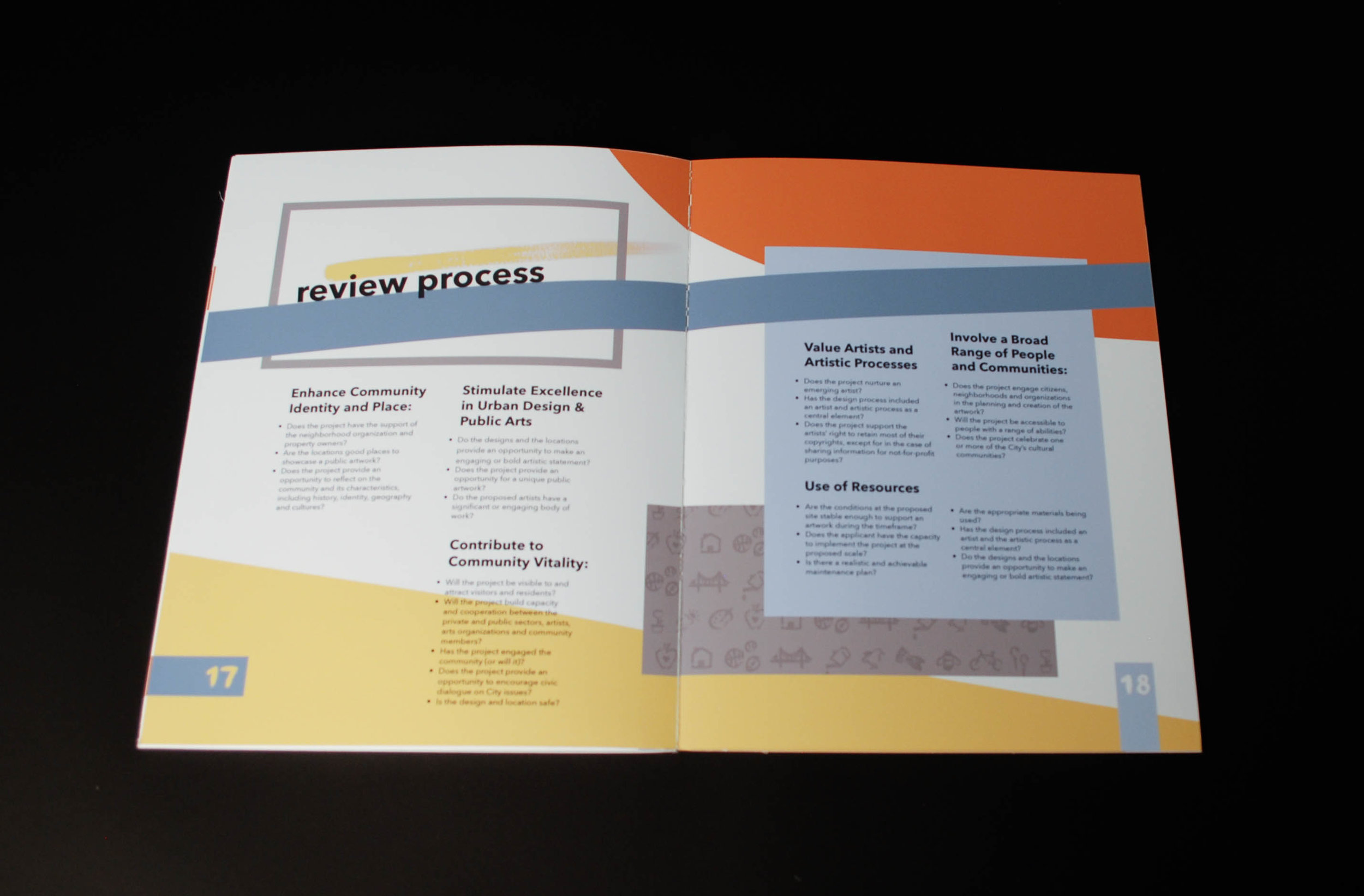
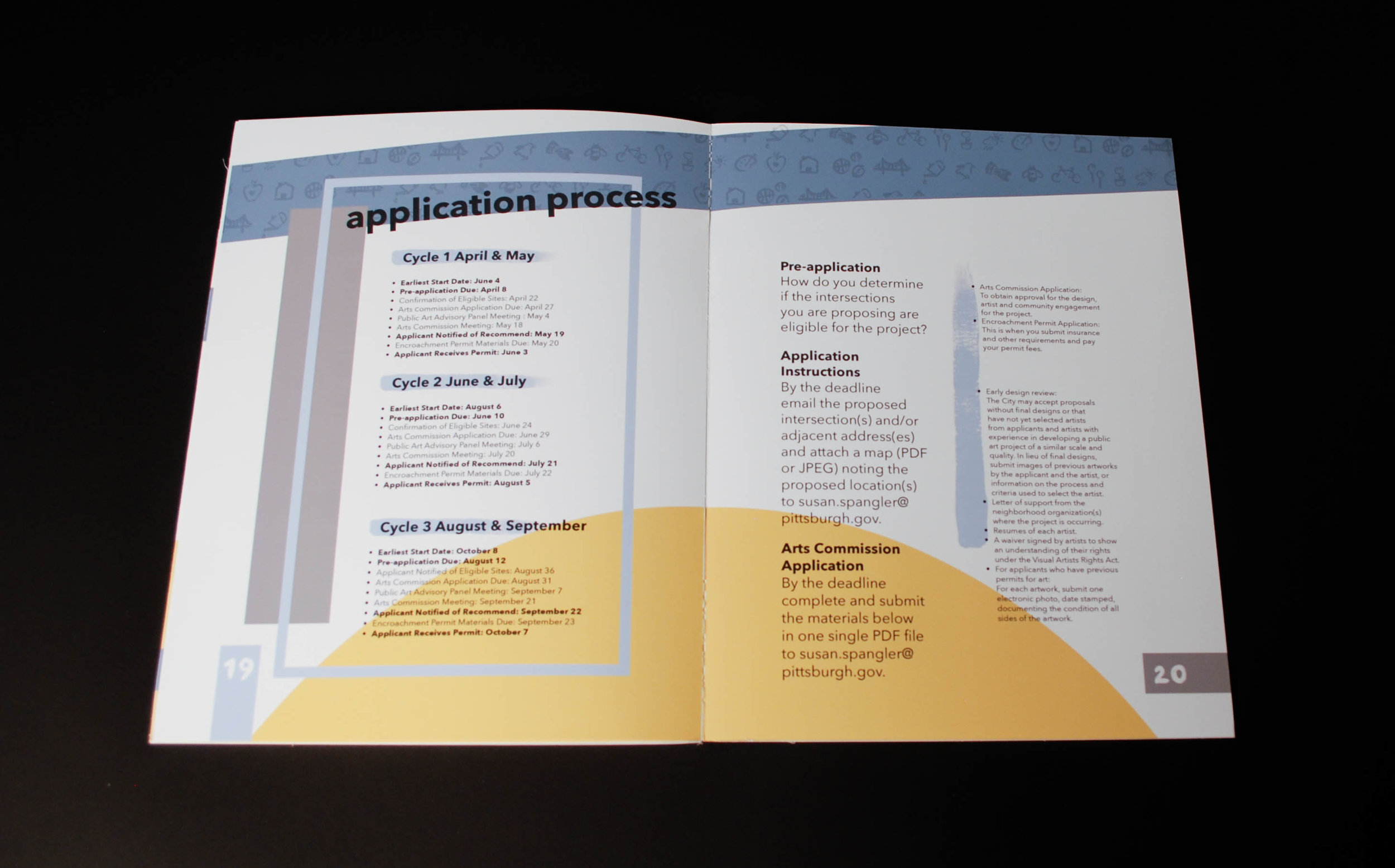
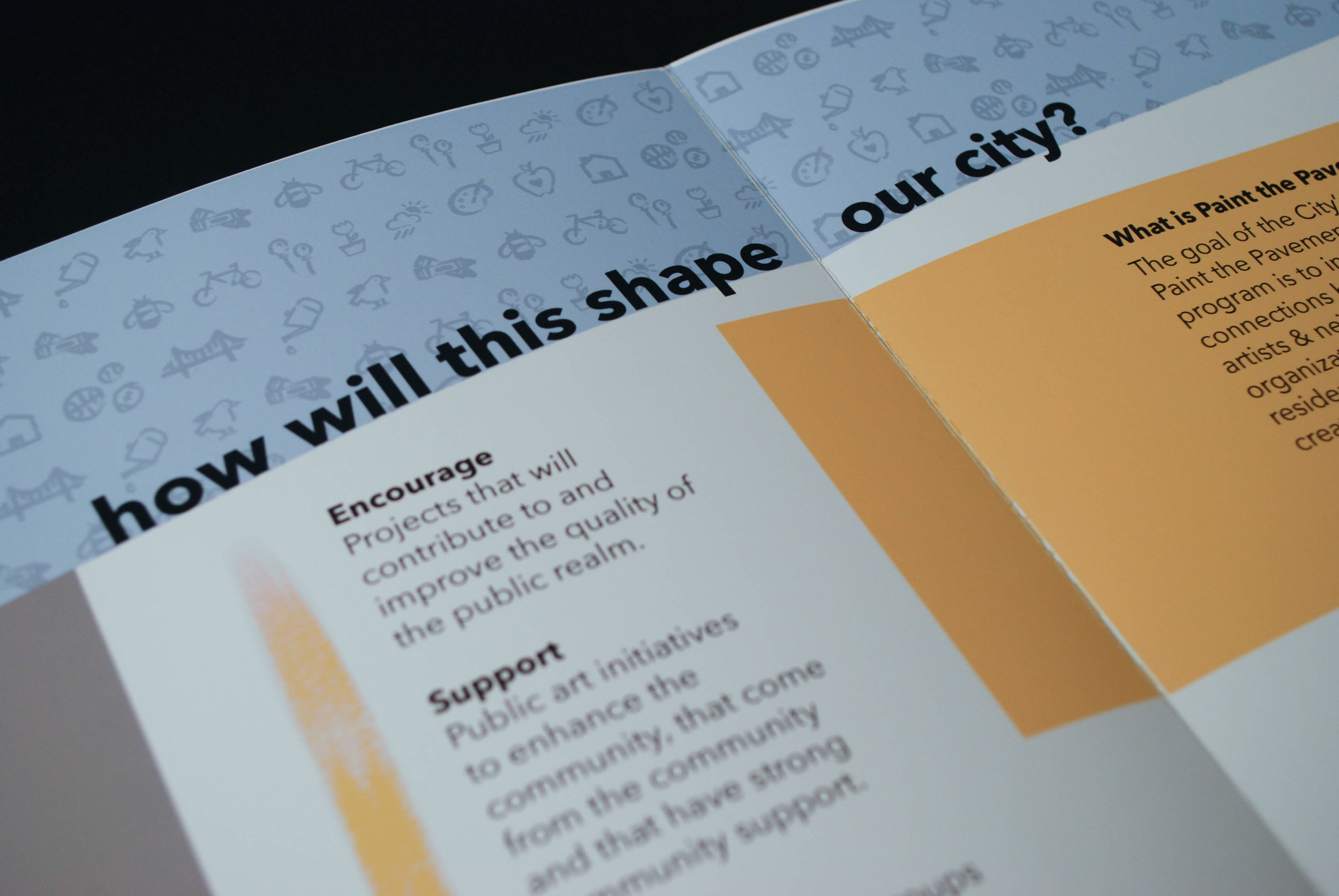
Within my system of things, I created a style guide which I implemented throughout the pages. After several color studies, I chose to use a gray, yellow, orange and two shades of blue throughout the book. For the icons, I took each of the final versions and translated them using painting to match my word mark. My word mark was inspired by the act of painting. I was playing around with several ideas and had painted the word "paint." I thought that the simplicity of the strokes created a playful element. The visual tension and word play throughout the booklet solidify this idea. Throughout the book, I implemented similar motions through paint streaks. The boxes established a "framework" and continued to work into the system a light-hearted feeling.
Sketchbook + Process
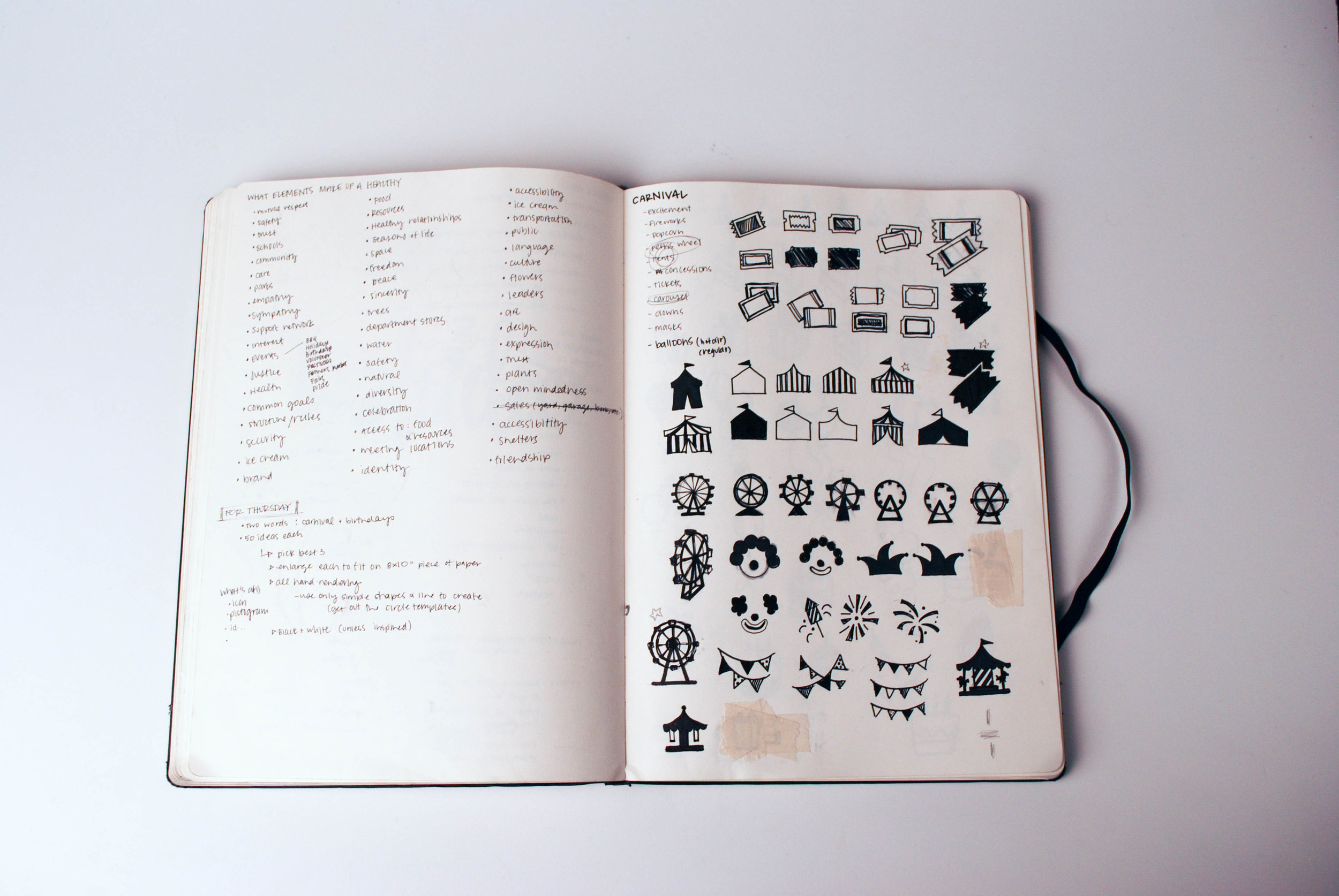
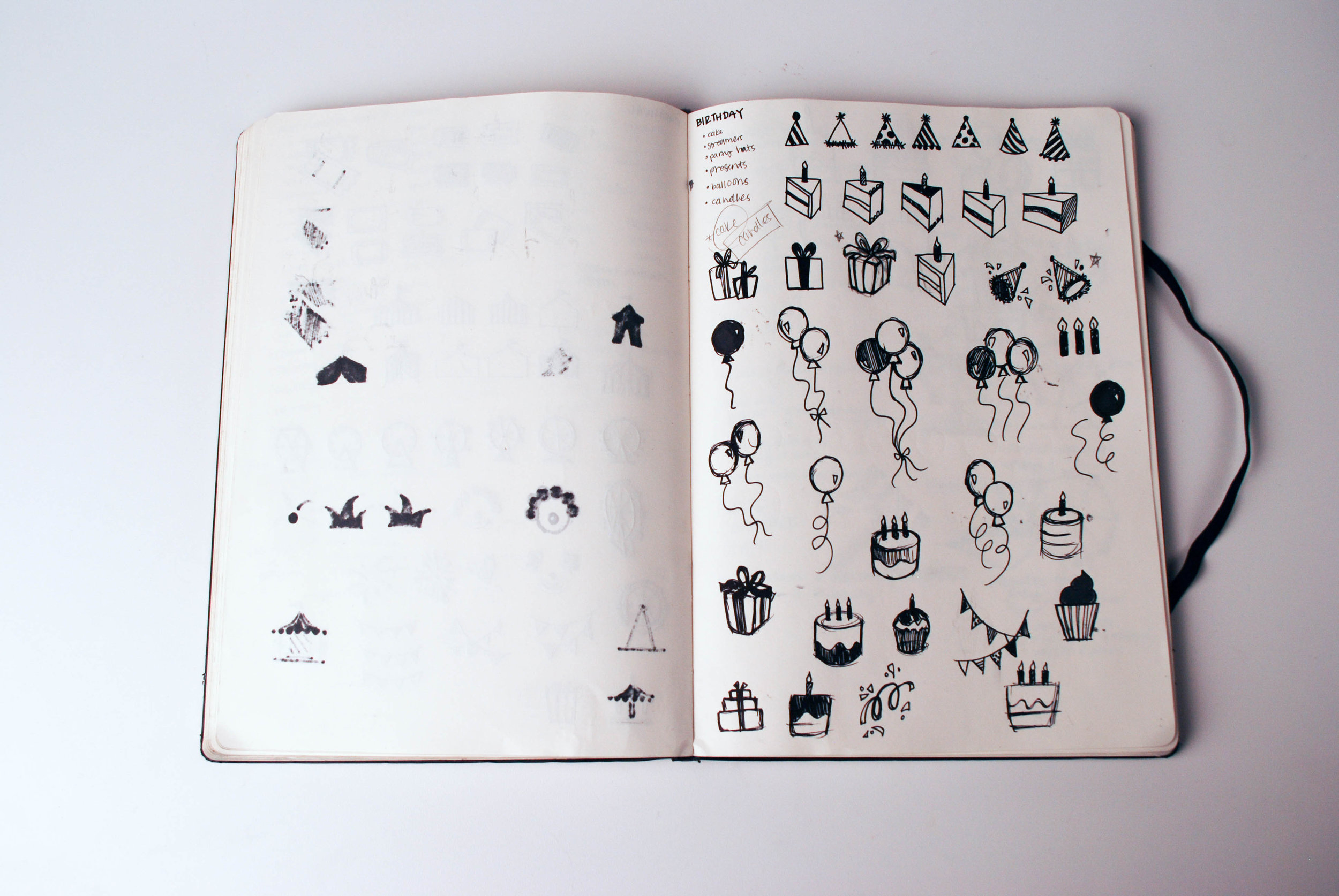
Our project began with a class experiment and investigation to discover what makes a "happy, healthy community." As a studio of twenty-five, we brainstormed terminology and elements that would make up this kind of space. Individually, we each created 50-100 icons of several words. This involved multiple iterations and exchanges of each other's icons and terms. In the end, we established a system of icons. In our projects, we could choose to use any of the icons as long as at least fourteen were involved in the final project.
By studying and creating icons, I developed a deeper understanding for form and meaning. Through our discussions as a class, we focused on designing with confidence, credibility, purpose and passion. We studied examples from Malcolm Greer and looked the strength of his word marks. Our icons translated in visual language to communicate and support our ideas throughout the project.
Below are some sketchbook and process documentation for my system + booklet