Instagram Analysis
Spring 2017 - Collaboration with Angee Attar and Anqi Wan.
This exercise was part one of a two-part project. It was meant as an experiment to see how we could play with information utilizing typography, color and imagery. Below are samples of our copy that we used to summarize our findings after investigating social media platforms, specifically Instagram.


Behind-the-Scenes
After studying multiple social medias, we decided to diagram the data we collected about time and space. Our focus for this data visualization was Instagram. Within Instagram's platform, there are certain images and hashtags associated with lifestyle and aesthetics. Additionally, Instagram-ers seem to be very obsessed with beautiful tables and food. For our visualization, we photographed a staged table with different food elements and decorations (such as the flowers and towel) to represent our information.


Final poster iteration
Copy for the Project
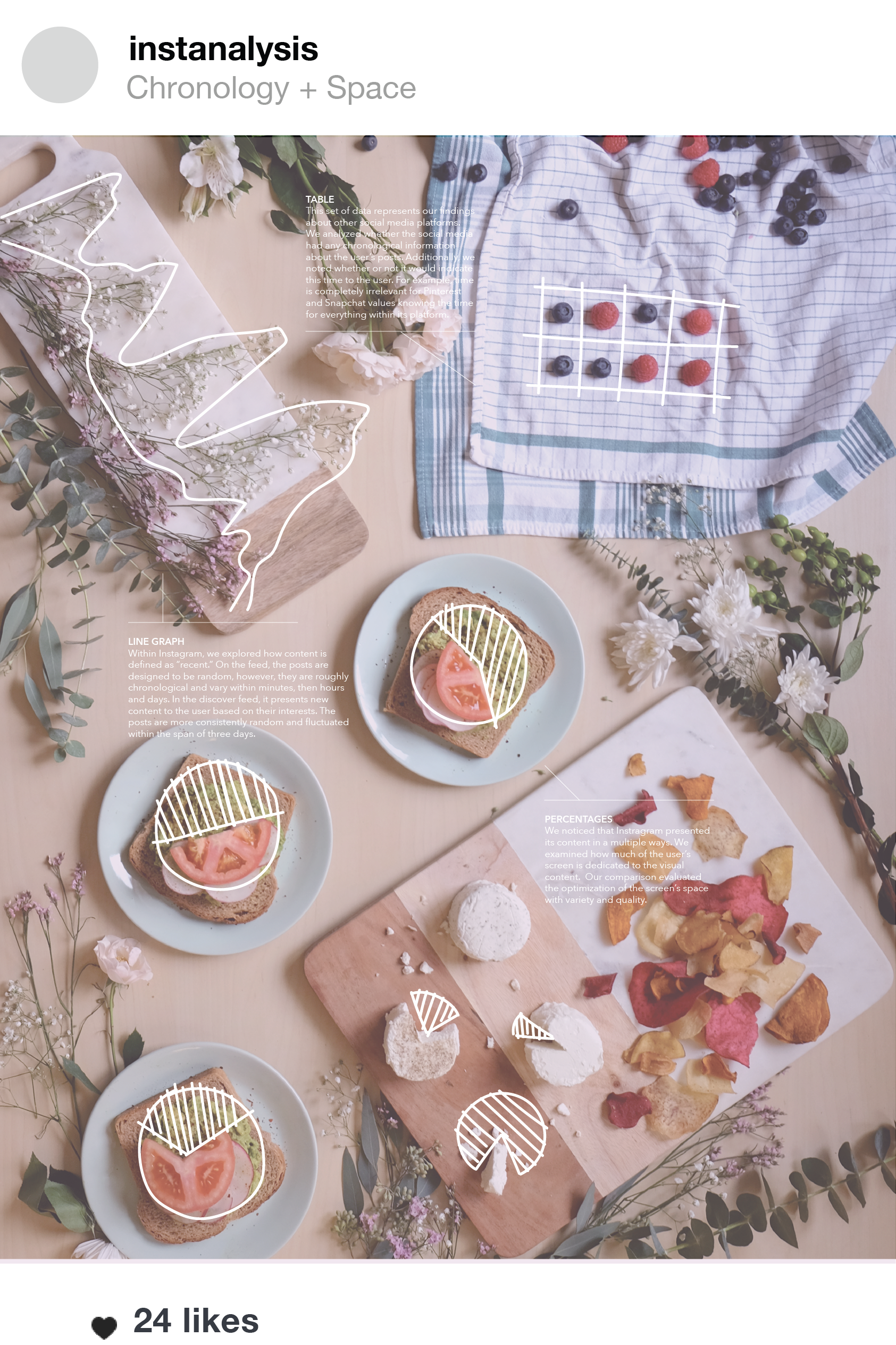
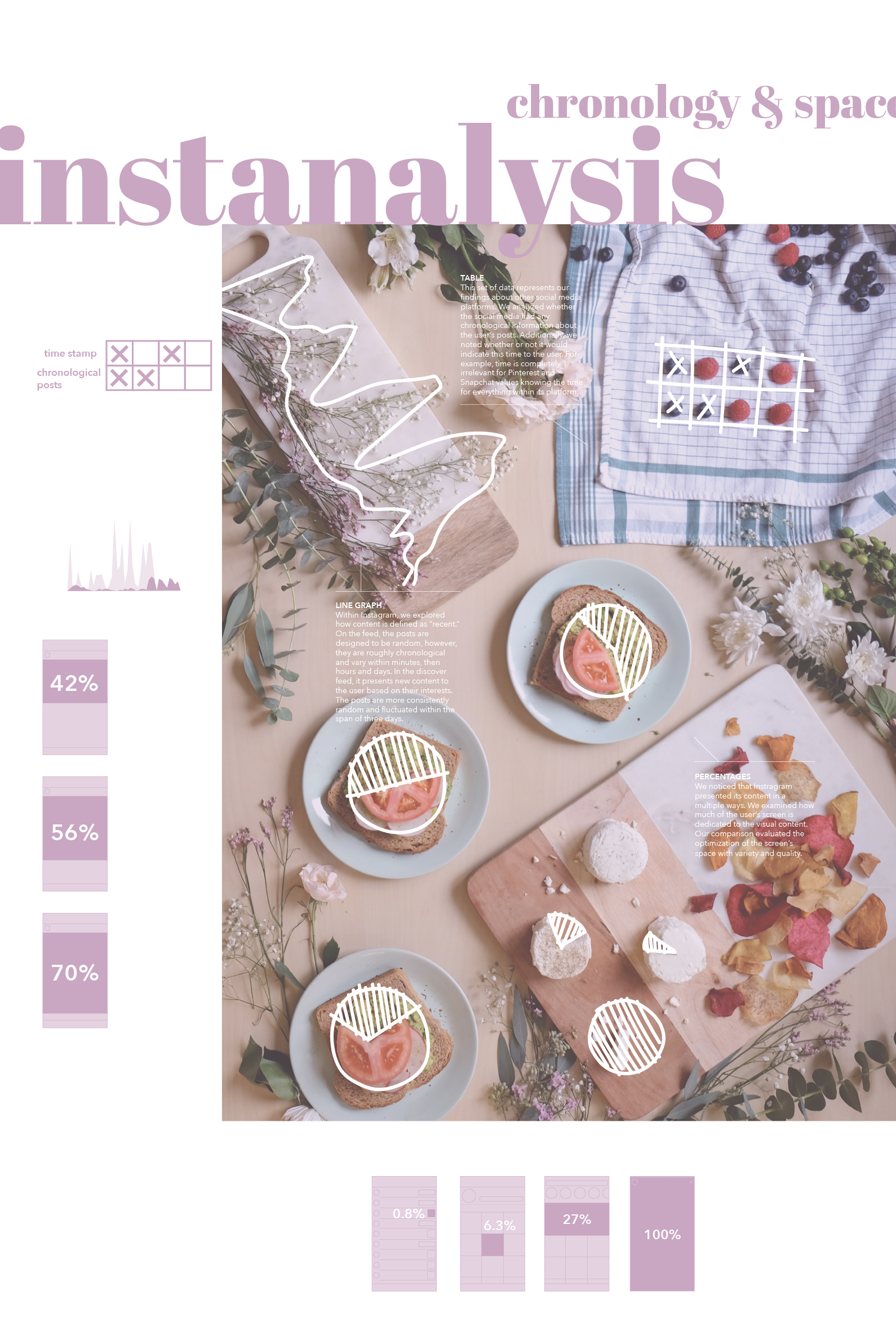
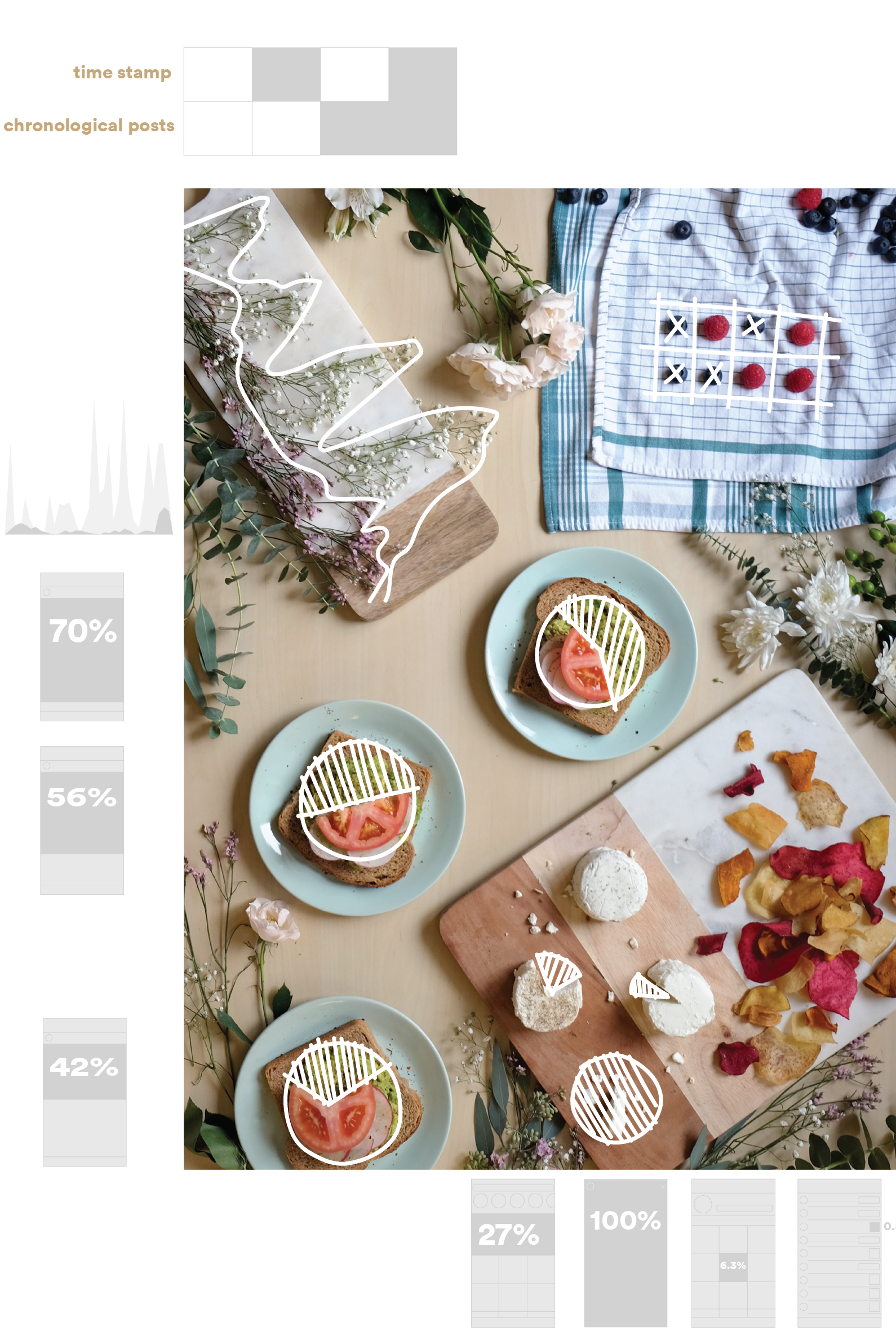
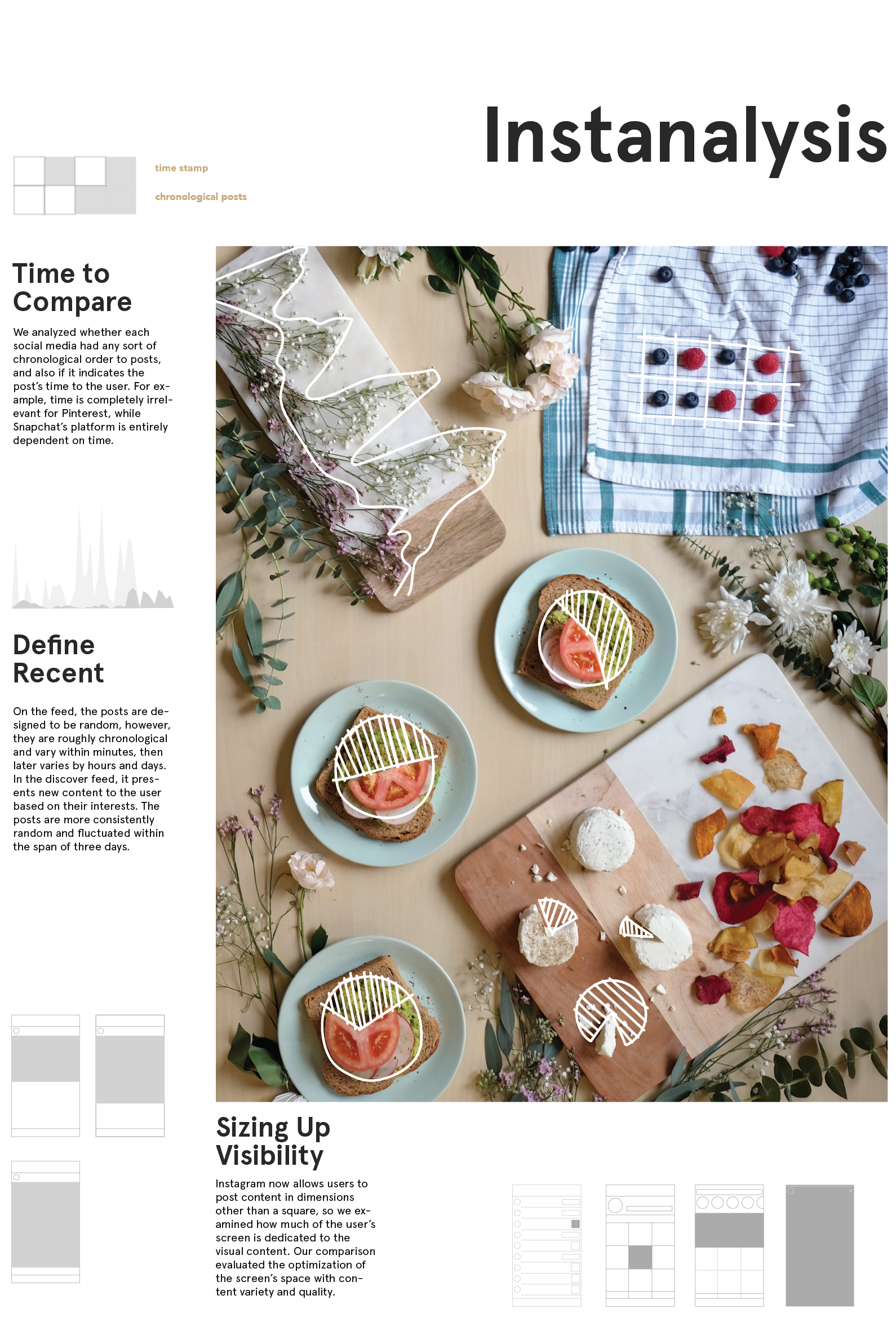
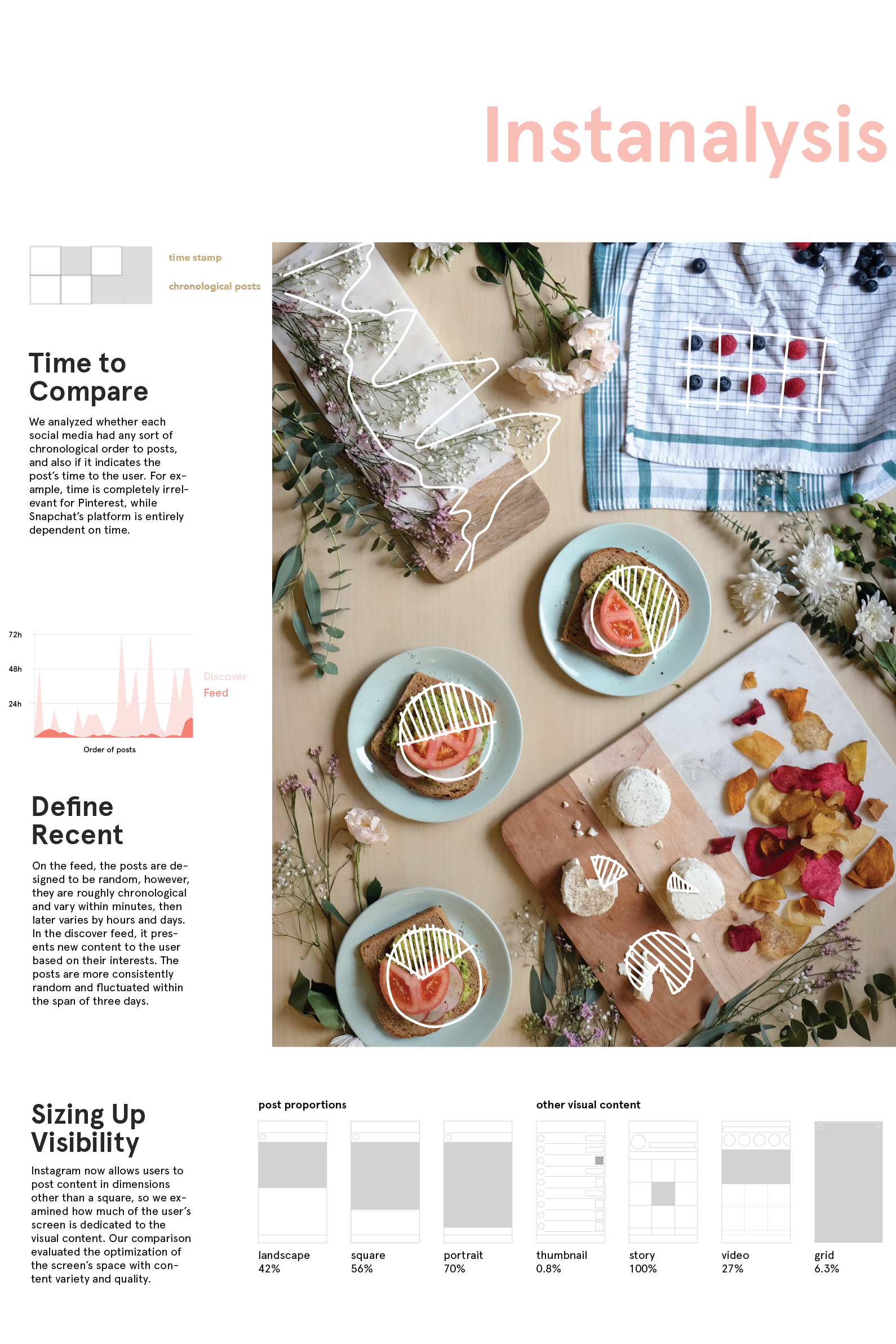
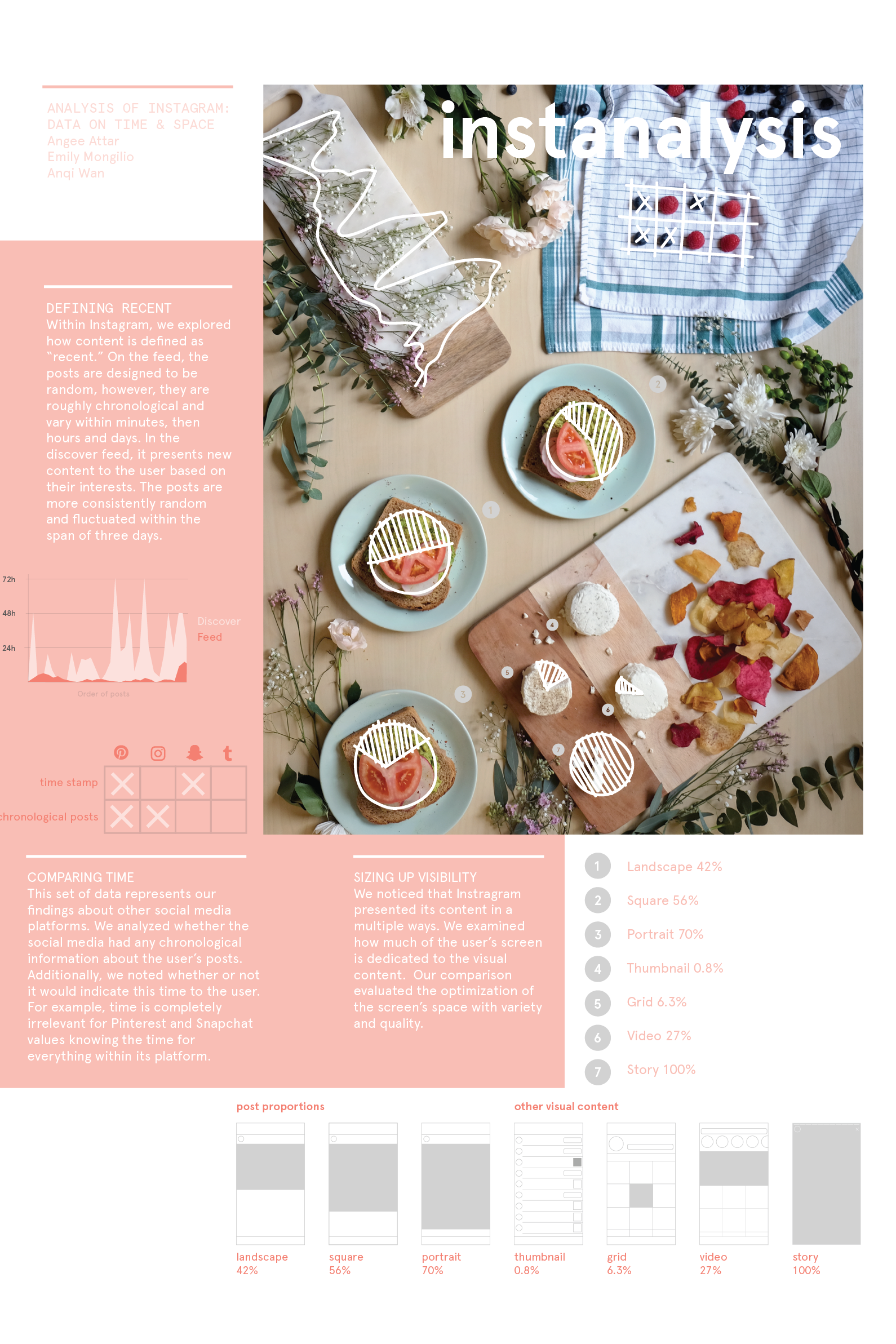
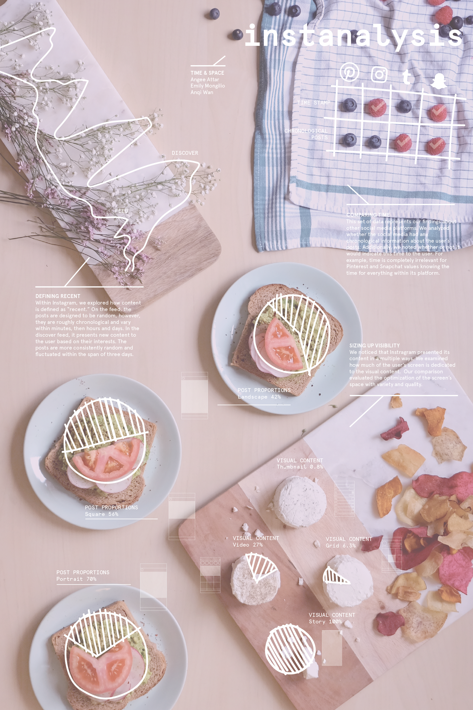
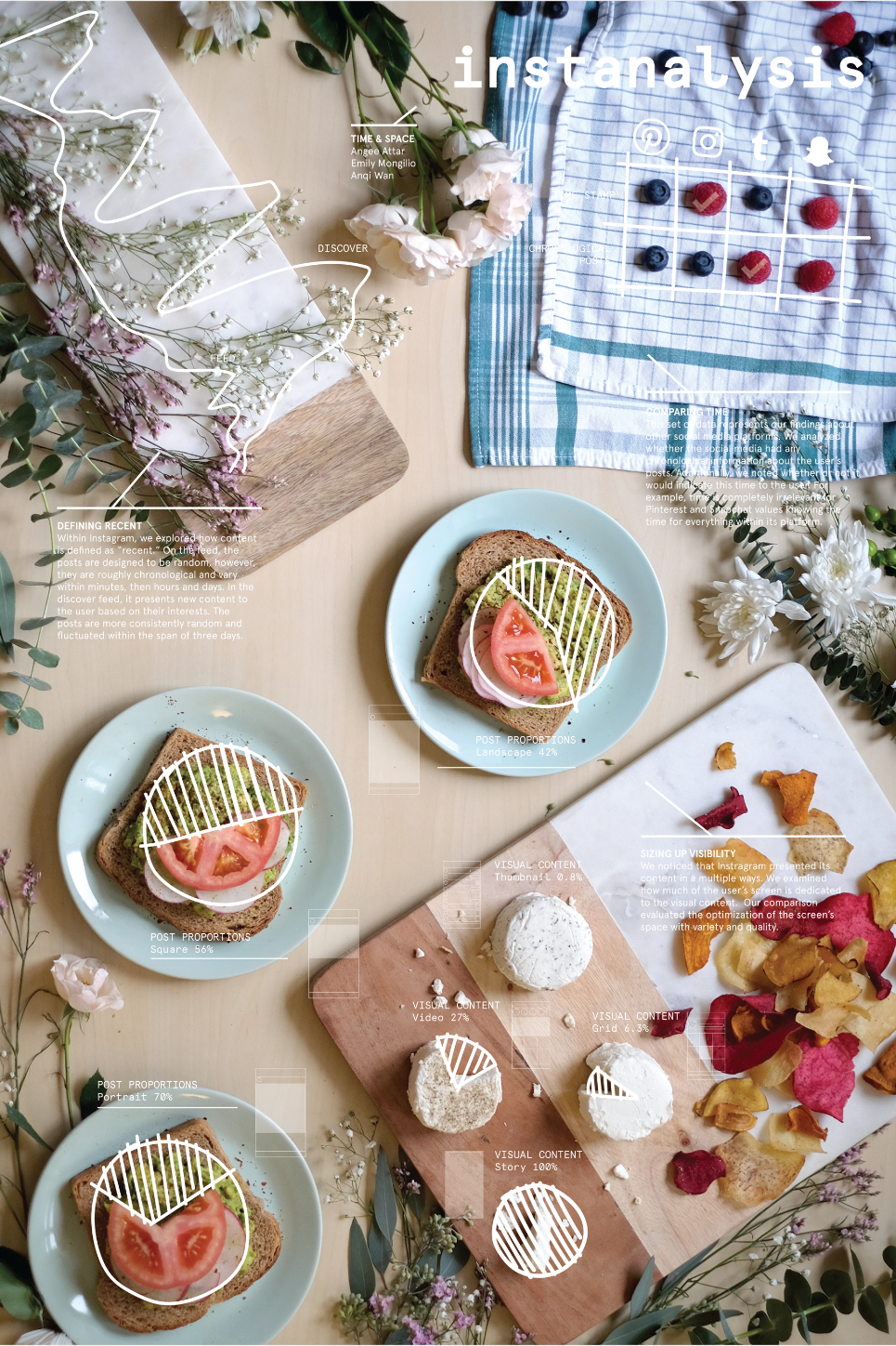
Defining Recent - Within Instagram, we explored how content is defined as "recent." On the feed, the posts are designed to be random, however, they are roughly chronological and vary within minutes, then hours and days. In the discover feed, it presents new content to the user based on their interests. The posts are more consistently random and fluctuated within the span of three days.
Comparing Time - The set of data represents our findings about other social media platforms. We analyzed whether the social media had any chronological information about the user's posts. Additionally, we noted whether or not it would indicate this time to the user. For example, time is completely irrelevant for Pinterest and Snapchat values knowing the time for everything within its platform.
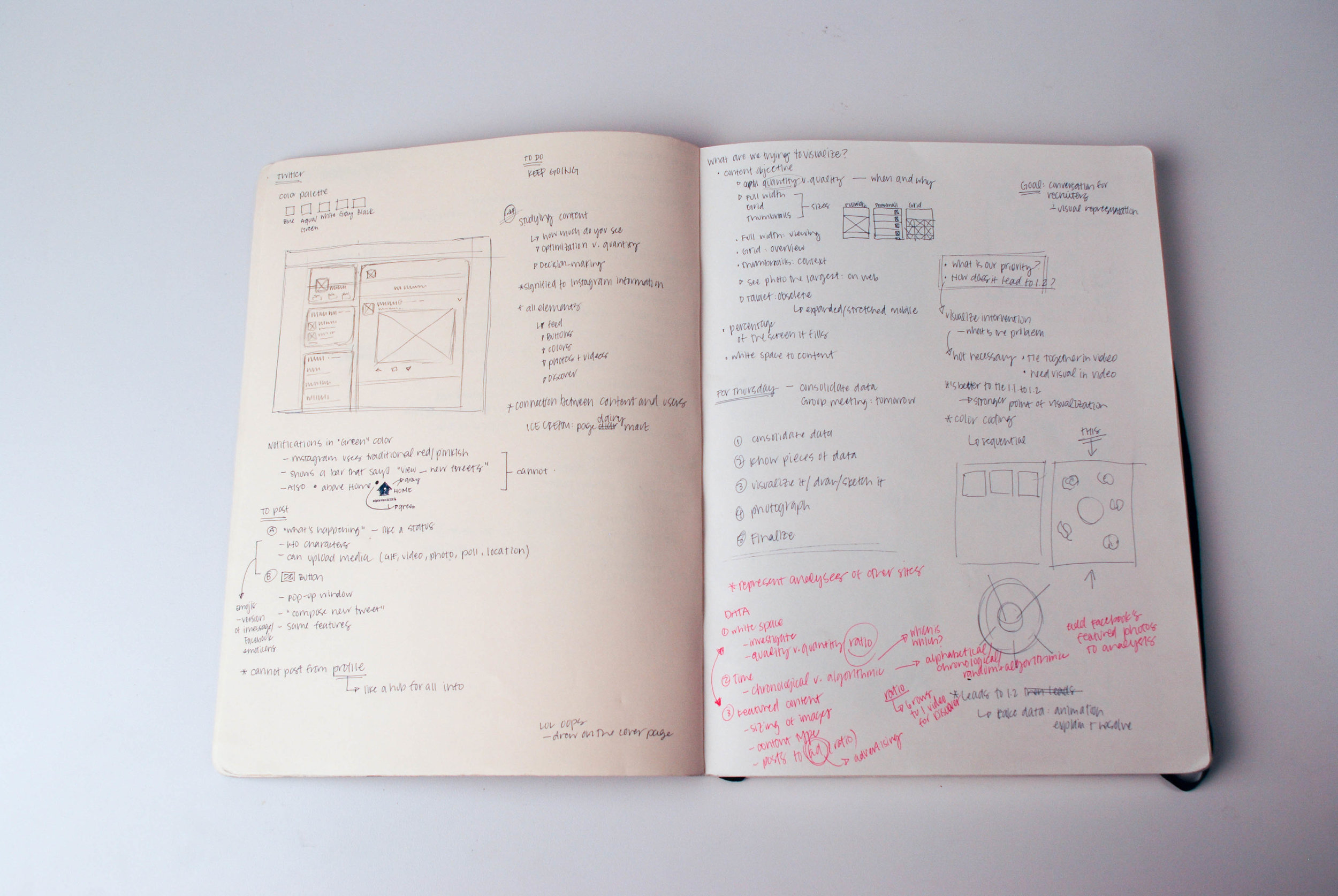
Sizing Up Visibility - We noticed that Instagram presented its content in multiple ways. We examined how much of the user's screen is dedicated to the visual content. Our comparison evaluated the optimization of the screen's space with variety and quality.
Sketchbook + Process
Prior to creating our table for our "food-stagram," we sketched and discussed how we wanted to represent the data. We played with several ideas to pick which food items would be successful for our information. We considered smoothies and fruit, sandwiches, flowers, ice creams, cookies and sweets. In the end, we decided a brunch/lunch spread would lend itself well to creating our beautiful table and our data.
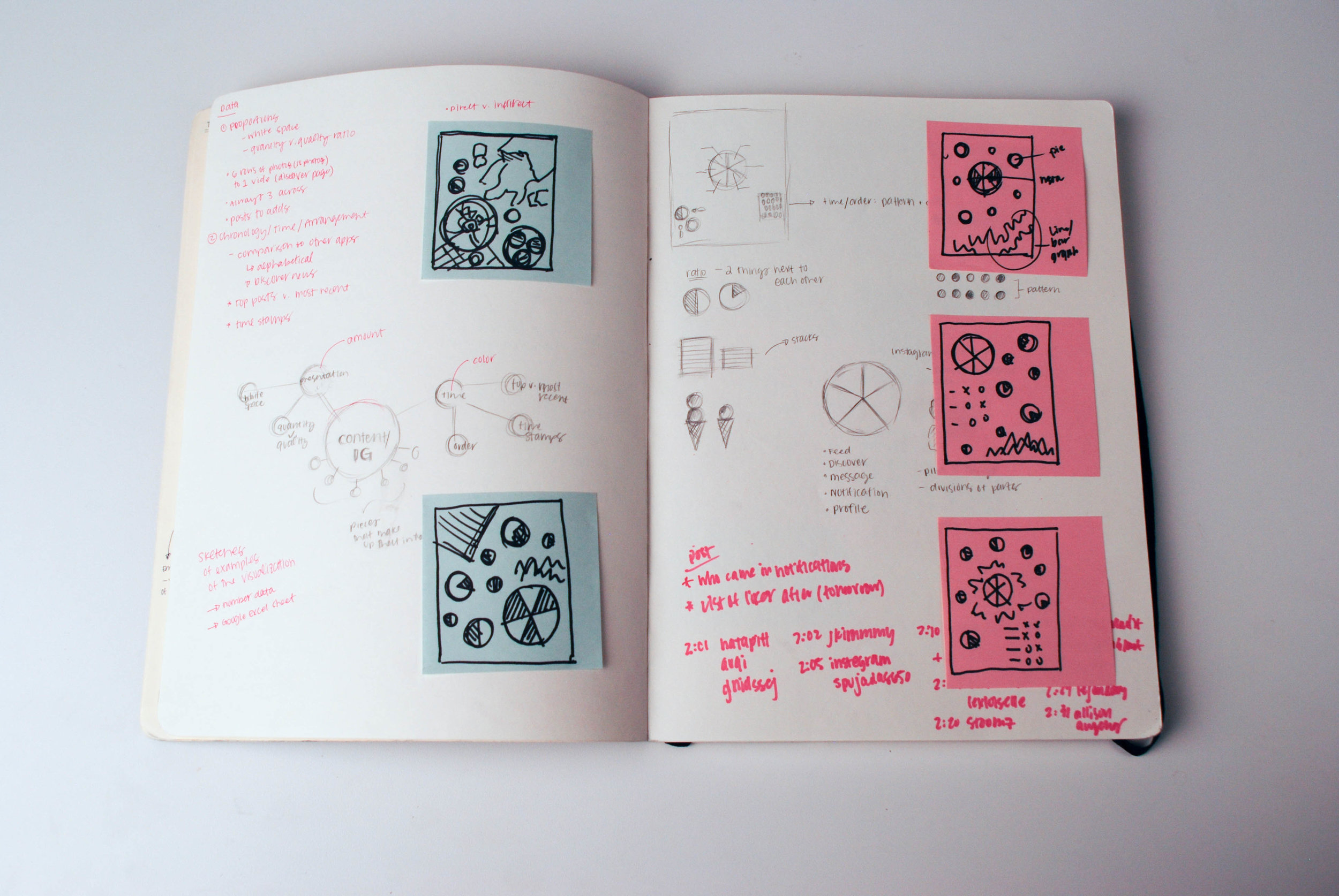
Visualizing the Data
Our data was represented through specific foods. Our data breaks down in the following way:
Time v. chronological posts: blueberries and raspberries
Recent (news feed v. discover page): flowers on the cutting board
Content size/post size: sandwiches and cheeses
For this visualization, we experimented with several formats and presentations of the information. Our ideas included trying to create an Instagram post, a magazine layout and overlaying the image with sketches. We had decided on the overlay due to the nature of the image and found that it was more effective to use stark contrast and call outs to indicate the information clearly.